Infotainment – the obvious portmanteau of information and entertainment – is the term used to describe the main technological interface of a car. This is where all the core electronic functions, such as navigation and audio, are controlled.
The automotive industry has come a long way in this area over the last two decades. In a world now obsessed with technology, it has become an increasingly important consideration for anyone choosing a new car. We’ve drawn on our vast experience across the board, to select our top three.
#3 – Volvo Sensus
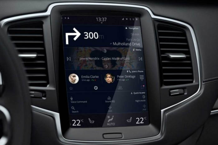
Volvo Sensus allows you to control your car and all its media systems easily. The latest generation of this infotainment system uses a tablet-like touchscreen, which, unlike most car systems, is portrait-orientated. It’s full of crisp, high-quality graphics, and blends seamlessly into the dashboard.
- The pages either side of the home screen may seem cluttered at first, but presenting everything at once makes more sense than burying settings in submenus. Many of these settings — such as the position of the head-up display, may only need adjusting once, and can then be forgotten.
- The touchscreen doesn’t have a ‘home screen’ in the traditional sense. Instead, the interface is split horizontally into collapsible sections for map, music and phone. A fourth option appears for Apple CarPlay or Android Auto when a smartphone is connected to the white-outlined USB port.
- With a design which looks much like your smartphone or tablet’s touchpad, the user experience is, unsurprisingly, very intuitive. When driving and not looking at the display for more than a few seconds, this design makes even more sense.
- There is a swipe-down panel for system alerts and notifications at the top, and swiping to the left of the home screen reveals a page of applications. To the right of the home screen is where you will find a settings page for adjusting car functions such as the position of the head-up display, colour of the interior ambient lighting, and various driver safety systems.
- Sensus keeps the climate controls visible at all times. This includes the temperature on each side of the cabin, simple controls for the heated front seats and steering wheel, plus the direction and intensity of the air vents.
All of this is very responsive, and although there is no haptic feedback, the interface responds so quickly that you’re never left wondering if your touches have been registered or not. It is also very intuitive and is placed high enough on the dashboard so that adjusting the climate doesn’t take your eyes from the road.

As is always welcome, the touchscreen is complemented by a handful of physical controls. These include a large volume dial below the screen, with a play/pause button in its middle. This is framed by buttons for skipping forward or back, and buttons for heating the windscreens.
A home button located centrally and below the screen always takes you back to the same page, which is reassuring to know. If you ever get lost in a menu, or aren't sure where to swipe next, a press of that button returns you to an overview of everything, along with your next navigation instruction.
Volvo prides itself on safety, simplicity and reliability – Sensus is exactly what you’d expect from a Volvo infotainment system and is good value for its bronze medal here.
#2 – BMW iDrive
BMW was one of the first manufacturers to launch a comprehensive infotainment system. Amazingly, iDrive is now 20 years old, and it remains one of the best. It uses a rotary controller to help the driver navigate the various menus and submenus, which many find easier than continuously tapping a touchscreen. All BMW models offer Apple CarPlay, although it is not standard on every model. BMW has offered CarPlay wirelessly since 2016, first with an annual fee, but more recently without charge. The newest generation, iDrive 7, also includes wireless Android Auto.
Some BMW models also offer gesture control, which allows you to do things like adjust audio volume and answer the phone with the wave of a hand, but in all honesty, this is still a gimmick rather than a true breakthrough.
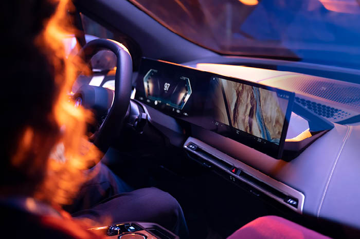
Unlike Tesla and many others, BMW has resisted the urge to fit its cars with huge touchscreens. Instead, a smart compromise has been struck in the form of a system that can be interacted with by touch, but also with more conventional button controls.
On that note, BMW even goes so far as to include eight shortcut buttons for selecting pre-set radio stations, and all major climate controls are physical instead of touch sensitive. A welcome, logical offering compared to a touchscreen used for everything. In a world where large touchscreens are quickly becoming the norm, iDrive is for those who prefer a more tactile interface.

- The video feeds from external cameras create an augmented view of the surroundings, providing the driver with a top-down view of the car, complete with all surrounding objects, and the ground beneath. Thus, you can see precisely how far you are from the vehicle behind while parking, but also check you are within the lines of a parking bay, and not too close to the kerb.
- Both displays are crisp, bright and easy to read. By default, the driver display shows fuel level, range, speed, engine revolutions, gear and outside temperature, with a large space in the middle reserved for a map of your current location. It's a thoughtful layout that gives you all the information you need without being overwhelming. Meanwhile, the central display is left to deal with Apple CarPlay, Android Auto, or BMW's own system for media, navigation, and vehicle information.
- When added to the usual parking sensor chimes, plus graphics to help judge distance, the system makes parking easy. If you prefer someone else complete a tricky manoeuvre, you can choose parking assist, which does the steering for you when entering a parking space.
iDrive has made the very most of its 20 years on the road – it has matured and gained features, but without ever feeling like a distraction in the way touchscreens can. There are a lot of buttons to figure out at first glance, but it doesn’t take more than one journey to work out everything you need, and after that everything is quicker and requires less concentration than tapping or swiping a screen. iDrive has earned its place on the second step of the podium through its years of steady evolution.
#1 – Jaguar Land Rover Pivi Pro
The British manufacturer has long been playing catch-up when it comes to in-car tech, but finally it has a system to match its rivals. Pivi Pro was even crowned best-in-class in the SmartBest awards, by prestigious motoring jury AutoBest.
- In addition, you can connect two mobile devices to the infotainment head unit at once using Bluetooth, so the driver and passenger can enjoy hands-free functionality concurrently without the need to swap connections.
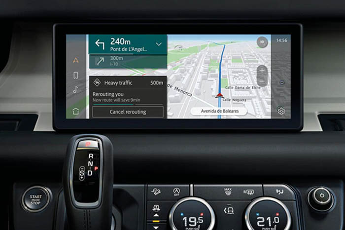
- The fast-responding and intuitive system has shortcuts to key applications such as navigation and music on the edge of the display closest to the steering wheel, placing them just a few inches from your hand. Information such as the time, battery level and signal strength of your connected smartphone sit neatly in the corner of the display.
- To enable almost instantaneous start-up, Pivi Pro has its own dedicated power source, so navigation is ready as soon as the driver is behind the wheel, while the embedded apps – including Spotify – provide full functionality even without your smartphone. Further connected features include Google and Microsoft Outlook calendar integration which enables the driver to view work diaries and even join important calls through the hands-free system. Meanwhile, weather at destination gives a forecast depending on the route entered.

- Next to this sits a rotating dial for switching between the car's driving modes and finding the mode you want can be done without looking away from the road.
- Below the touchscreen are a selection of touch-sensitive buttons for lesser-used cabin controls like windscreen defrosting and air recirculation. These are illuminated, highly legible and easier to use at a glance than you might think.
- The home screen shows your next navigation instruction, including distance to destination and time of arrival. Also shown is the status of your connected smartphone and whatever music is playing, along with playback controls, all at once. You can then rely on the digital instrument display behind the wheel (or the head-up display projected onto the windscreen) for more detailed navigation instructions, while leaving Pivi on its minimalist home screen.
- A detail that shows JLR has really thought about this system is how, on the Pivi home screen, there are audio mute buttons for both the navigation and media/radio. That way, you can see at a glance (and adjust with a tap) whether each system is muted or not. Volume can also be controlled with a physical scroll wheel next to the start/stop button and gear selector, with a press muting the system.
- Although Apple CarPlay and Android Auto are included as standard, JLR’s own system is outstanding. The screen is sharp, clear and bright without being distracting, and the navigation system is simple and intuitive. You can access 90% of commonly used functions from the display with a maximum of two clicks.
- To either side of this panel are a pair of rotating dials for the driver and passenger to control their own air and seat temperature. Each dial is used to adjust temperature by default (shown on a digital display within the dial) but can also be pulled outwards to adjust fan speed and pushed inwards to heat or cool each seat.
- The steering wheel controls are a mix of traditional and touch, with a scroll wheel for navigating the driver display and a rocker switch for adjusting the cruise control. Other buttons, including the configurable ‘favourite’ button, are touch sensitive but physically click when pressed to help confirm you have activated them.
Pivi Pro not only looks great, but also functions well and has clearly been thought out carefully to be both aesthetically pleasing and safe to use without distraction. A long-awaited and fully deserved gold medal for JLR. Bravo.


